Ex-Google-Maps-Designerin äußerst sich zu umstrittenen neuen Farben
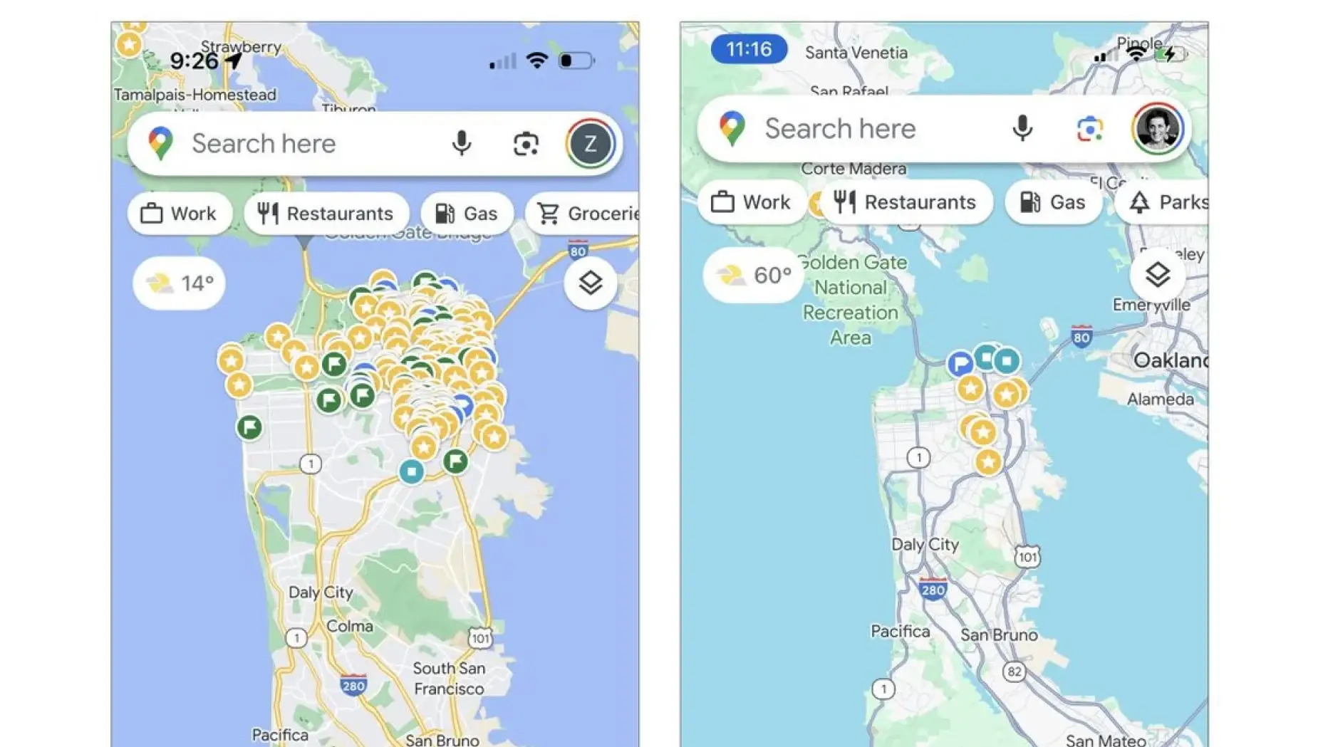
Bild: X/Google
Wasser- und Grünflächen nun schwerer zu unterscheiden. Chance auf Aufräumen bei Bedienelementen sei verpasst worden.
Elizabeth Laraki war 2007 eine von zwei Designer*innen, die an Google Maps arbeiteten. Nun hat sich die ehemalige Google-Angestellte zum neuen Aussehen des Kartendienstes zu Wort gemeldet. Aus einem langen Beitrag bei X gehen einige Kritikpunkte hervor, wie der GoogleWatchBlog beschreibt.
Elizabeth Laraki @elizlaraki
15 years ago, I helped design Google Maps.
I still use it everyday.
Last week, the team dramatically changed the map’s visual design.
I don’t love it.
It feels colder, less accurate and less human.
But more importantly, they missed a key opportunity to simplify and scale.
–––
Google Maps has started to widely roll out updated map colors:
- All roads are now gray
- Water changed from blue to teal
- Parks and open spaces are now mint green
It seems the goal was to improve usability and make the maps more readable.
Admittedly, I do think major roads, traffic, and trails stand out more now.
But the colors of water and parks/open spaces blend together.
And to me, the palette feels colder and more computer generated.
But color choices aside…
If the goal was better usability, the team missed a big opportunity:
Google Maps should have cleaned up the crud overlaying the map.
–––
So much stuff has accumulated on top of the map.
Currently there are ~11 different elements obscuring it:
- Search box
- 8 pills overlayed in 4 rows
- A peeking card for “latest in the area”
- A bottom nav bar
(Personally, I would LOVE to see usage metrics for all these overlays.)
The map should be sacred real estate.
Only things that are highly useful to many people should obscure it.
There should be a very limited number of features that can cover the map view.
And there are multiple ways to add new features without overlaying them directly on the map.
–––
Here’s how it could look:
- Keep the search box
- Keep the bottom bar
- Remove everything else from the map
- Roll the most used features into the bottom bar
- Bury the less used features elsewhere in the app
I assume the search box and directions are top priority and should remain prominent.
My Location and map layers (satellite, traffic, etc.) could move to the bottom bar.
The explore overlays (restaurants, gas, etc.) could live in the bottom bar in “Explore” and open as cards.
The additional space in the bottom bar could be used for Saved, as a “More” option, or could be removed entirely.
There are many variations of how features could be arranged.
But the key points are:
- Dramatically simplify
- Strongly prioritize map visibility
- Bury legacy and low use features
–––
It’s normal for products to accumulate features over time.
But it’s also super important to stay vigilant and continually clean them up.
In many ways, it’s interesting to see history repeating itself.
In 2007, I was 1 of 2 designers on Google Maps.
At that time, Maps had already become a cluttered mess.
We were wedging new features into any space we could find in the UI.
The user experience was suffering and the product was growing increasingly complicated.
We had to rethink the app to be simple and scale for the future.
It seems like it’s time for Google Maps to do this again…
–––
For more on design + tips for early stage founders, follow me on X:
@elizlaraki
Am 22. November, 2023 um 16:42 via Twitter
Das neue Design von Google Maps fühle sich kälter, weniger präzise und weniger menschlich an, schreibt die Designerin. Dass Straßen nun in einem dunkleren grau dargestellt werden, mache sie immerhin besser sichtbar, allerdings seien Wasser- und Grünflächen nun schwerer zu unterscheiden. Die verwendete Farbpalette wirke mehr computergeneriert.
Mehr dazu findest Du auf futurezone.at
Kurze URL:
Das könnte Dich auch interessieren:
Ein kleines Video von den 4 kleinen Störchen von Freilassing.
Heute haben wir ein Katzi und ein paar Hasi, am Salzburger Flughafen, abgelichtet.
Ähnliche News:
Experte warnt vor Erstarken von "Schurken-KIs" und fordert "Plan B"
SpaceX und Nasa: Ein Starlink-Netzwerk für den Mars
SpaceX stellt Anzug für Weltraumspaziergänge vor
AWS-S3-Bucket: Kostenexplosion durch nicht autorisierte Anfragen
aleX fotografiert: Am Friedhof die Eichhörnchen
"Financial Times" gewährt ChatGPT Zugriff auf ihre Texte
aleX fotografiert: Am Mondsee
Extreme Landung: Lufthansa Boeing 747 muss dramatisch durchstarten
Serverfehler legt Nordkoreas illegalen Zeichentrick-Export offen
Thunderbird für Android kommt mit Exchange und ohne Add-ons
Weitere News:
Durchbruch bei schnellladenden Quantenakkus
Behörden warnen vor mehr Cyberangriffen durch KI
Apples neues iPad Pro hat einen versteckten Vorteil für Reparaturen
Offizielle Displayport-2.1-Kabel sind zu kurz
Ist ein gutes Foto was Wert, wenn es Keiner sieht?
Call of Duty soll im Gamepass erscheinen
aleX filmt: Die 4 kleinen Störche von Freilassing
Intels 1,5-Kilowatt-KI-Beschleuniger ist bestätigt
TCL CSOT zeigt 4K-Display mit 1.000 Hz
Die digitale E-Card scheitert noch immer an Apple
Einen Kommentar schreiben
Kommentare
Bitte bleibe sachlich und fair in deinen Äußerungen. Sollte dein Kommentar nicht sofort erscheinen, ist er in der Warteschlange gelandet und wird meist zeitnah freigeschaltet.
(0)
Bitte bleibe sachlich und fair in deinen Äußerungen. Sollte dein Kommentar nicht sofort erscheinen, ist er in der Warteschlange gelandet und wird meist zeitnah freigeschaltet.
Kommentare:
Du hast bereits für diesen
Kommentar angestimmt...
;-)
© by Ress Design Group, 2001 - 2024