 Extreme Landung: Lufthansa Boeing 747 muss dramatisch durchstarten
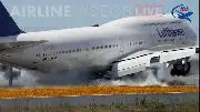
Für die Passagiere war das harte Aufsetzen wohl ein Schockmoment. Am Ende konnte die Maschine aber sicher landen.


 Elizabeth Laraki @elizlaraki
 Extreme Landung: Lufthansa Boeing 747 muss dramatisch durchstarten
 Thunderbird für Android kommt mit Exchange und ohne Add-ons
Du hast bereits für diesen
Kommentar angestimmt...
;-)
© by Ress Design Group, 2001 - 2024